Using & Editing Tables

Maps are helpful when you want to see one data point over a geographical region. If you want many data points, than a Comparison Table may be created. There are several different types of tables to choose from, each displaying variables in different ways. View the Glossary for descriptions of each table and when to use them. For example, Time Series Tables allow comparisons of all years available for any variable chosen. This allows you to identify trends over time.
Example of a Comparison Table

Example of a Time Series Table
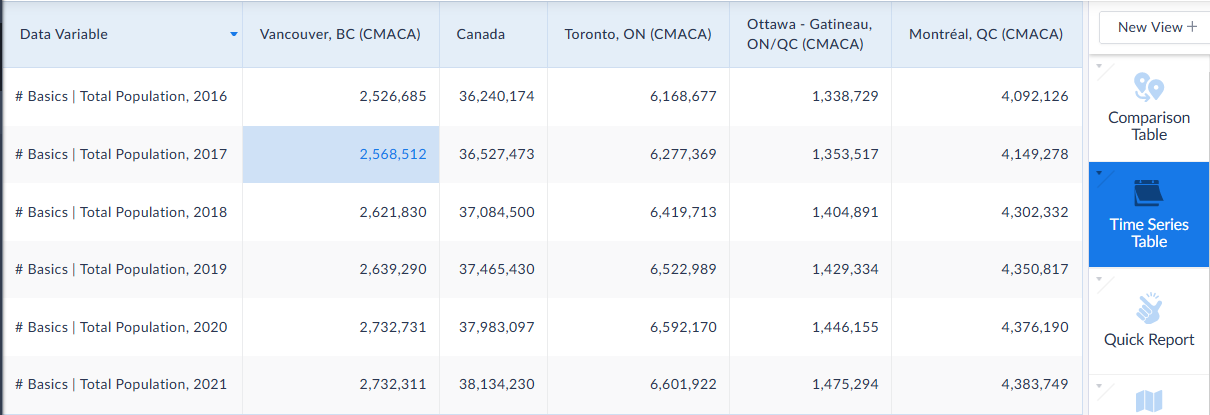
Time Series Table Example
For our example, we will use a Time Series Table to track median household income across our chosen locations: Vancouver, Montreal, Ottawa, Toronto, and all of Canada to compare the changes of income over time.
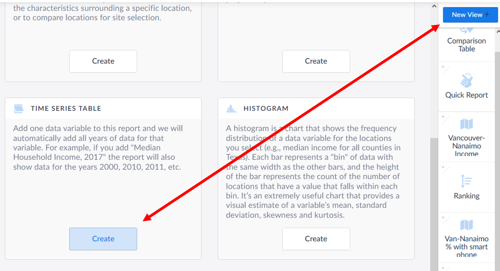
First select New View in the top-right of the screen and select Time Series Table.
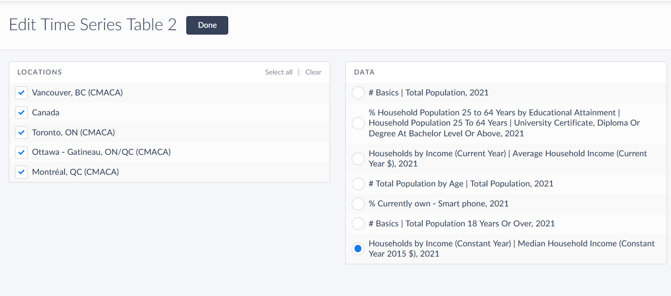
The Edit Time Series Table panel opens. Specify Median Household Income and the locations you want to compare. Click Done to generate your table.
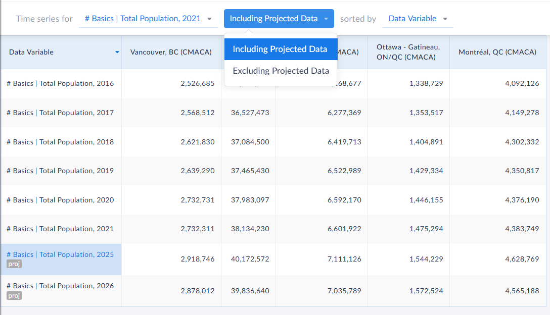
Use the dropdown to change variables or add in projections for that data variable. You can also add additional locations, or additional data by selecting either the Data or Location tabs in the left sidebar.
Export Your Table
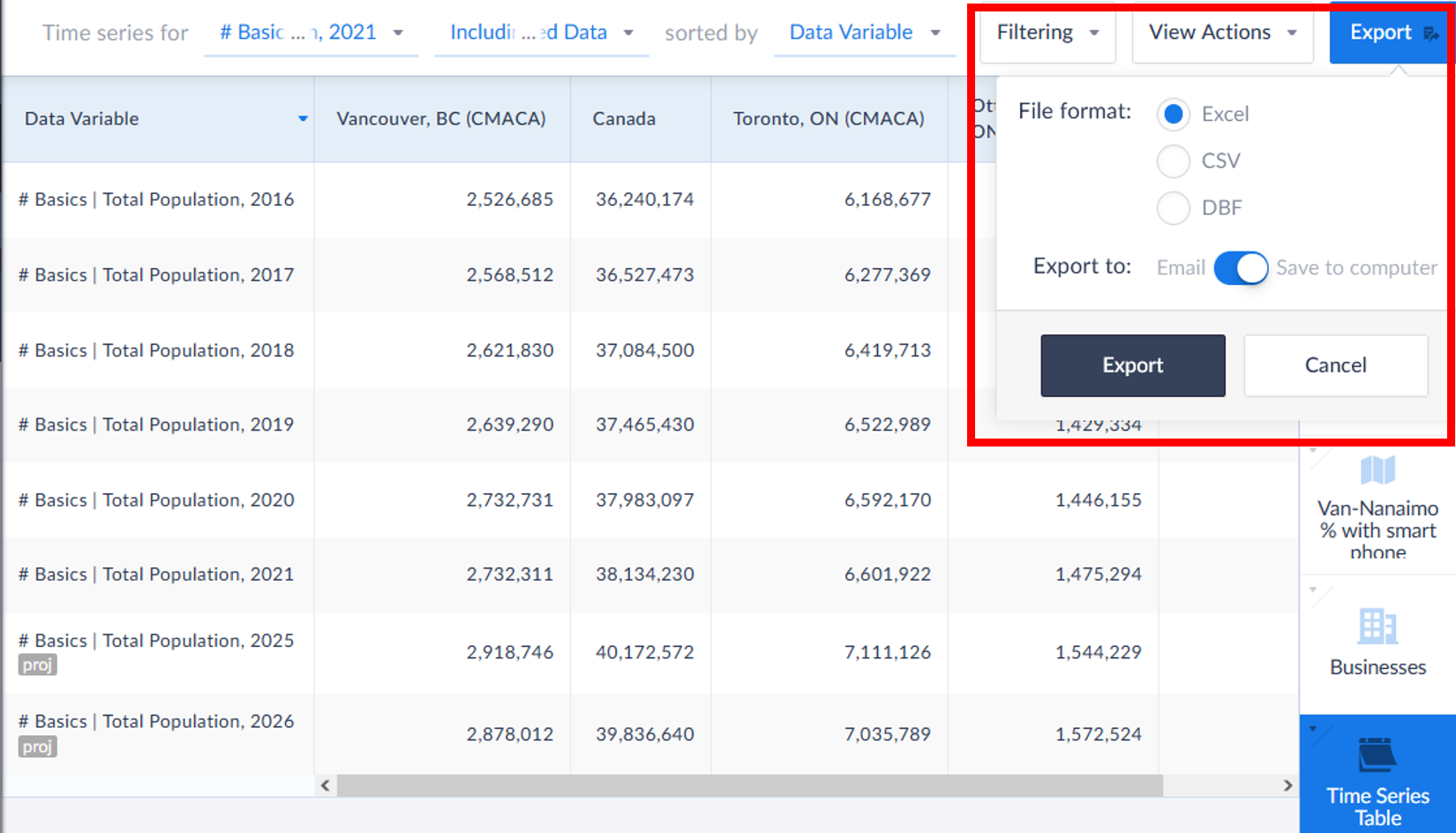
When you are finished you can chose Export in the top right corner. A panel opens so you can chose whether to export the data as an Excel file, CSV or DBF. The document can be saved to your computer or sent to an email address.
Go to Types of Reports in the left sidebar for additional types of tables that you can generate. Also read the SimplyAnalytics documents listed in Additional Help & Resources in the sidebar for more report examples.
